Parece que este serviço está em espera

I will design a mobile responsive website in HTML, CSS, bootstrap, and javascript

R
russel1980
R
russel1980
Muhammad S
Algumas informações são exibidas no idioma inglês.

Sobre este Serviço

Hi,

I'm a professional front-end developer.


Do you need to convert PSD to HTML, XD to HTML, Figma to HTML responsive website?

I can do this fast and efficiently. I have 8 + years of experience and did 500+ projects.


My Services:


  • PSD to HTML
  • XD to HTML
  • Figma to HTML
  • Ai to HTML
  • Zeplin to HTML
  • Sketch to HTML
  • Invision to HTML
  • PDF to HTML
  • Or any kind of images to HTML


You will get:


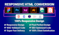
  • HTML5/CSS3 Pixel perfect Markup
  • Mobile-friendly responsive design
  • Cross-browser compatibility 
  • SEO optimized code
  • Regular work update
  • W3c validated + much more ...


Why should you hire me?


  • High-quality work
  • Fast communication
  • Super fast delivery
  • Unlimited revision until you are satisfied
  • 24/7 Customer Support


NOTE: Cost and time depend on the page content. So please message me before placing an order to make a perfect deal.


Thank you so much for visiting my gig.


Respeite os direitos de terceiros

Esteja atento ao fato que é contra as políticas do prestador da Fiverr incluir temas, modelos ou outros elementos no trabalho entregue que infrinjam os direitos de terceiros ou leis aplicáveis. Leia mais em nosso Guia de Criação Digital Responsável.

Conheça mais sobre Muhammad S

Muhammad S
  • A partir deBangladesh
  • Membro desdemar. de 2020
  • Idiomas

    Espanhol, Árabe, Hindi, Inglês
As a front-end web development expert with over 8 years of experience, I offer professional web development services with a focus on responsive design using Bootstrap. I specialize in creating beautiful and user-friendly websites that work seamlessly across all devices. With this gig, I will develop a custom front-end for your website using Bootstrap, the most popular front-end development framework. I will create a responsive design that adapts to different screen sizes, ensuring a consistent user experience on desktop, tablet, and mobile devices.